Data Completeness
Overview
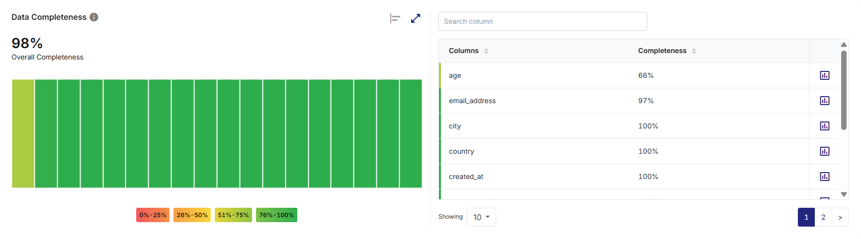
The Data Completeness widget provides a clear view of how much data is populated versus data missing across columns in a dataset. It helps users quickly assess whether critical columns contain sufficient non-null values and understand the overall completeness of the dataset.
This widget supports data profiling to identify missing data patterns and determine readiness for downstream analytics, reporting, or rule enforcement. It offers a fast, intuitive way to understand how complete your data is-both at the column level and across the dataset-making it an essential tool for early data quality assessment.
What the Widget Analyzes
-
Profiling dimension: Data completeness
-
Level of analysis: Column-level with dataset-level aggregation
-
Calculation basis:
-
Completeness percentage for a column is calculated as:
(Number of non-null values / Total number of records) × 100
-
Overall Completeness represents the aggregated completeness across all columns in the dataset, derived from individual column completeness values.
-
What the Widget Shows
-
Completeness percentage or values for each column.
-
Visual comparison of completeness across columns using multiple chart views.
-
A dataset-level Overall Completeness score.
-
Color-coded completeness bands indicating data quality thresholds.
-
A supporting column list that displays exact completeness percentages for each column.
How to Read This Widget
-
Each visual element (point, bar, or block) represents a single column in the dataset.
-
The value of the element (line point, bar height, or tile) corresponds to the percentage of non-null values.
-
Color-coded completeness indicators represent alignment with threshold ranges.
-
Columns closer to 100% indicate fully populated data.
-
Lower values highlight columns with missing or null records.
-
Hovering over any visual element reveals a tooltip with the column name and exact completeness percentage or value.
Available Views
The widget supports multiple visualization formats in various chart or graph views on the left pane.
On the top right corner of the visualization pane, use the:
-
Chart or graph view icon to switch between available view types
-
Expand icon to visualize a larger view for detailed analysis
-
Collapse icon to restore the widget to its default size

Note:
Hover or click action on any chart/graph element reveals or highlights column-specific completeness values. All interactions are read-only and do not alter the dataset.
|
View Type |
Description |
|---|---|
|
Line / Area View |
This view displays completeness values as connected points and filled areas to show relative variation across columns. Useful for spotting drops or inconsistencies. |
|
Bar View |
This view displays individual bars for each column, enabling precise comparison of completeness percentages. |
|
Summary (Overall) View |
This view displays a single Overall Completeness (%) value along with color-coded blocks representing completeness ranges. |
Color Coding and Thresholds
Completeness values are visually grouped using color bands. These ranges help users quickly identify columns requiring attention.
|
Range |
Interpretation |
|---|---|
|
0% – 25% (Red) |
Very low completeness |
|
26% – 50% (Orange) |
Low completeness |
|
51% – 75% (Yellow) |
Moderate completeness |
|
76% – 100% (Green) |
High completeness |
Supporting Panes
The widget includes a Data Completeness tabular summary pane on the right, always visible alongside the visualization pane on the left, providing detailed column-level context. It displays a list of all dataset columns along with their Completeness (%) values.
Pane Interactions
-
Provide a column name in the Search column list box to filter columns in the table and quickly locate a specific column by name.
-
Click the download icon to export the result as PDF, CSV, or XLSX file. You can either download a consolidated file or individual widgets.
-
Download individual widgets to analyze specific visualizations in detail and gain deeper insights. Files are saved using a standard naming format by default, which you can rename locally after download:
<Data Profiler Results Widget name>_<Source Table name>.<pdf | csv | xlsx>
Example: DataCompleteness_bronzepatientvisitdetails.csv
-
For consolidated Excel downloads, each widget is exported to a separate worksheet. For example, three widgets are saved as three sheets within a single Excel file.
-
-
Click on the column headers to sort columns in ascending or descending order.
-
Click the chart icon for each column to open the data distribution (Completeness details for current vs. last 5 runs) view for that specific column. This enables a transition from summary level counts to value level distribution analysis.
-
Scroll to access to additional columns when the list exceeds visible space.
How to Interpret the Results
-
Columns at 100% completeness contain no null values.
-
Columns below 100% indicate the presence of missing data.
-
A high Overall Completeness score suggests strong data population across the dataset.
-
Columns with consistently lower completeness may require data enrichment or cleansing.
When to Use This Widget
-
To identify columns with missing or incomplete data.
-
To validate dataset readiness for analytics, reporting, or modeling.
-
To support completeness-based data quality rules.
-
To prioritize remediation efforts for critical fields.
 Recommended Topics Recommended Topics
|
What's next? Data Uniqueness |